Menu  
 

Mark Swanson

Mark is a Senior UI/UX Designer at MINDSCAPE. He makes the websites you use easier to use and has been designing for the screen for over 14 years. Outside of work, he likes watching documentaries, playing music and rolling in the dirt with dogs (both his own and random strays). He also doesn't photograph very well.
Find me on:
November 7, 2017
6 Tips for Designing a Click-Worthy CTA.png?noresize

6 Tips for Designing a Click-Worthy CTA

by Mark Swanson

One of the key aspects of developing a good UX ( AKA user experience) on a website is outlining clear user paths (the series of pages that site visitors are most likely to view based on their needs and interests). One way to move people down a particular path, and forward in their buying journey, is with a well crafted CTA.more

August 29, 2017

Design Trend Alert - Big, Bold Typography

by Mark Swanson

Content is king. Websites should be designed to deliver content, not merely serve as pretty wrappers to drop content into. With this growing emphasis on content it’s no surprise that typography plays a major role in the user experience and is arguably the most important design element of your site. Great typography not only looks good, but is highly functional.more

April 6, 2016

Why Your Website's Photography Really, Really Matters

by Mark Swanson

If a picture is worth a thousand words, a really bad picture may be worth 10,000. Photography really matters. Probably even more than you think. The quality of the photography on your website directly relates to the perceived quality of your business. This means you could have the greatest product in the world, but if the photography is bad, people are also going to think the product is bad.more

March 23, 2016

The Death of the Slider

by Mark Swanson

Sliders, Rotators and Carousels. It doesn't really matter what you call them, but chances are, you know what I'm talking about. (and in case you don't it's the thing at the top of the website that cycles, usually unrelated, text and images). And it’s also quite possible that you think no website is complete without one. But you're wrong! I'm going to take the next several minutes to dispel that myth and hopefully, put these ancient artifacts of the web to bed once and for all. You can call them whatever you want, but for the sake of this article, I’m just going to call them sliders. They’re a staple of the website of yesteryear. They're that old friend at the party (usually me) who's long overstayed their welcome. The problem is, a lot of people still think that guy's the life of the party, when in reality, he needs to be kicked out and never invited back. At MINDSCAPE, we deal with modern websites on a daily basis. We create them and we look to them as a source of inspiration. The problem is, if you're not actively seeking them out, a truly modern website is still hard to come by. The thing is, most websites were last redesigned years ago, so while they’re using outdated techniques, we still see sliders everywhere. And since we see them everywhere, we just assume we need one on our site.more

December 3, 2015

Can your Landing Page pass the Blink Test?

by Mark Swanson

5 Tips to Make your Landing Pages really take offmore

March 26, 2013

What makes the Modern Website Modern?

by Mark Swanson

This post has been republished here from its original source. As the years come and go, the types technology we use to access the web change and our approach to web design and development changes along with it. What made a good website five years ago does not make a good website today. When meeting with new clients, one of the first questions I ask is "What sites do you like and what do you dislike?" The answers are all over the board, but what I don't really see are examples of beautiful, modern websites that represent what it means to have a real online presence today. It becomes difficult for clients to understand what to expect from a modern website, as most of the sites they are seeing on a daily basis are not the types of sites we are striving to create at MINDSCAPE. This article aims to describe what I think constitutes a modern website in 2013, highlighting the way web design has evolved over the past several years. My hope is to illustrate to our partners the technology that's available to us today and why you should be taking advantage of it.more

February 21, 2013

Choosing the Right Front-End Framework

by Mark Swanson

This post originally posted at mark-swanson.com CSS frameworks have been around for awhile. They've just changed a lot in the last several years. What started out as basic fluid or static grid systems have now evolved to include Javascript libraries, responsive layouts, more robust user interface elements and advanced typography.more

December 4, 2012

Creating More Usable Forms on Desktop and Mobile

by Mark Swanson

One of the biggest usability problems I've run into when viewing sites that are not properly optimized for mobile is forms. They can look terrible, be incredibly difficult to use and are something to be avoided at all costs. Let's be honest, forms are generally cumbersome to use on desktop. They always have been. All of these flaws are amplified when you cram them into a 3.5 inch screen. So what can we do to make the experience better? Last month, I attended a workshop at An Event Apart Chicago, put on by Luke Wroblewski. He had some really great ideas on web form usability -- especially in the mobile context. The workshop really got me thinking about all the things we could be doing to create better experiences. So, with some inspirate from Luke, here are several things we can do right now to create them.more

November 20, 2012

Principles of Interaction Design every Web Designer Should Know

by Mark Swanson

If you're a Web Developer or Designer, you probably hear about Interaction Design all the time these days. I hear it a lot at work. After a bit of reflection, a lot of Web Designers would probably say "I already do that." Others might be intimidated by the term, confused about what Interaction Design actually means as it pertains to their job. And that's the thing. Interaction Design applies to all sorts of things, not just Web Development. Interaction Design is about understanding the behavior of people and how they use your product. Although its sort of a buzzword that's popped up in recent years, Interaction Design has always been a component of good Web Design. As our technology becomes more advanced, so do the interfaces and experiences we can dream up and bring to life. Interaction Design is a bigger component of Web Design now because we are viewing our content on laptops, smart phones, tablets, televisions and all kinds of other devices. Those are all unique experiences and we have some great tools at our fingertips to make each of them great.more

November 29, 2011

Looking for Mobile Analytics? Six Sites to Check Out

by Mark Swanson

So you've built a groundbreaking mobile app in the "virtual farting" genre or a great mobile website. You're hoping people will check it out. You've built it, but how do you know if they will come? Traditional Web analytics will sometimes work on mobile sites, but they are not always ideal. A more mobile-centric approach to analytics may sometimes be necessary. It really depends on how large your mobile audience is. But how will you ever find that out without mobile analytics? Here are six solutions to mobile analytics for your mobile website or mobile app. Spend some time reviewing each one to make sure it fits your needs. I'm not endorsing them so much as compiling them here in this article as a quick round-up of the major players in mobile analytics. In fact, the descriptions below each one are basically marketing copy pulled from their respective sites.more

November 15, 2011

Mobile Homepages Level Out Bounce Rate

by Mark Swanson

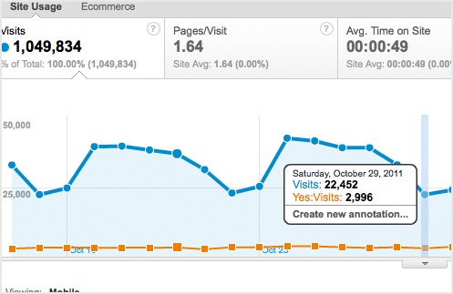
I've been sorting through Google Analytics today to see which of our clients are getting mobile traffic. Not surprisingly, they're all getting it. I'd say relative to the overall traffic, the mobile slice of the pie is similar on all sites. What's not similar, though, is the the bounce rate, which is the amount of people staying on that site and the amount of people leaving without doing anything. On a lot of our sites, the bounce rate for the normal site hovers around 30%-40%, where the mobile sites are closer to 60-70%. It makes sense. Most of these people are accessing a regular site on their mobile phone, so it's not surprising that the bounce rate is a lot higher. It's just harder to use. So I compared this to a few of the mobile sites we've developed and noticed that just having that mobile friendly homepage in place seems to really level out the bounce rate. It brings it right back down to that 30-40% range, similar to the desktop site.more

September 21, 2011

The Advantages of Having a Mobile Site

by Mark Swanson

At Mindscape, I've really been jumping head first into mobile web development for the last year. I find it interesting to create something that works across the board on several different devices. We're at a point where we're starting to offer this to clients, and surely the question of "Why do I need a mobile site?" is going to come up a lot more frequently. So I thought I'd address some of the key benefits to creating a mobile-friendly website in this article. Keep in mind that developing a mobile site doesn't necessarily mean creating a separate site for mobile devices. It has more to do with creating a site elastic enough to display nicely on whatever device your end user is viewing it on.more

January 21, 2011

Dark Patterns: Interfaces Designed to Manipulate Users

by Mark Swanson

Through some random surfing over at Smashing Magazine, I came across a site devoted to Dark Patterns. I was unfamiliar with the phrase, so spent a little time reading about it. What I found was that the phrase “Dark Patterns” is a catch all that applies to a variety of deceptive design patterns in web design. I watched a 30 minute lecture on Dark Patterns to become more familiar. Here are a few of the different Dark Pattern techniques I learned about.more

January 7, 2011

HTML 5 and the Mobile Web

by Mark Swanson

If you’re a web developer, all the HTML5 talk of the past year or so most likely gets you pretty excited. I won’t go into the details and specs of HTML5 because chances are, if you’re reading this, you’re familiar with what HTML5 has to offer and all the great things that are coming with it. I sat in on a couple HTML5 sessions at the Future of Web Design Conference in New York a couple months back and while it’s all really cool and exciting, I couldn’t help but feel a little cheated thinking that the technology is at our disposal, but it could be a few years before we can really utilize this for our clients due to the legacy Internet Explorer browsers out there that are incapable of handling modern technology on the web. Then I started thinking about HTML5 and the mobile web and got excited again.........more

January 5, 2011

People are using the mobile web to purchase (or not purchase) your products.

by Mark Swanson

Even though mainstream adoption of the mobile web as an commerce tool may be a couple years off, people are using their mobile devices to make purchasing decisions right now.more

Subscribe to Email Updates

Let's Talk